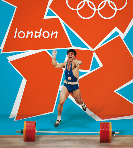
With the Olympics in full swing, it’s a chance for the design community to re-heat some of the many arguments that have circulated about the brand design and identity of the 2012 Games. This recent easy-ride interview for Fast Company gives Wolff Olins a chance to say ‘told-you so’, and come out with some vivid brand double-speak in the process (the favourite of which has to be; “I don’t think dissonance means discord. It means an ability to be slightly off-center and still be cool – and actually means you’re cool because you’re slightly off center.”)
Elsewhere there have been overviews of the entire ‘branding package’, and there are still the myopic arguments being aired that this is not (and in fact nothing in the entire designed universe ever has been) as good as Munich ’72.
It seems that the most apparent issue is that in the contemporary games, speaking as someone who lives near to an olympic venue, there is so much branding of stuff – every ‘touch-point’ they would no doubt tell us, from the station signage, to the track numbers, to the incredible volume of advertising – that ‘design’ gets squeezed out at every turn, in favour of ‘roll-out’ (I don’t, to be clear, think these things are mutually exclusive, but they aren’t exactly the same either.) It also neglects that fact that this kind of thing (note this type of material is often missing from the fan-boy ’72 nostalgia-fests) could happen then (in 72), in a way that seems difficult to conceive of now, unless part of some kind of heavily strategised brand narrative. To wrap up, perhaps a word on the man who gave his name to that erstwhile branding establishment responsible for 2012, (a man who, in the words of Terry Eagleton, “one suspects would brand his own kneecaps if there was profit to be squeezed from it…”) – I think it would be a good time to revisit this analysis of OnBrand by Wally Olins.
