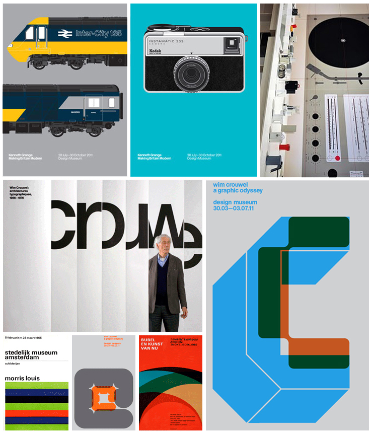
Always a fan of drawing out connections where there are non, we were wondering why everything seems so ‘flat’ at the Design Museum at the moment. What we’re talking about here is about how the exhibitions are presented, rather than the subject of the exhibitions themselves — From the already-quite-flat work of Wim Crouwel*, to the not-at-all flat work of Dieter Rams, subject to a methodical and clinical flattening by Biblioteque, (and the promotional material for the current Kenneth Grange exhibition), we were wondering why this flatness, of a particular 1960’s/70’s variety, seems to be so popular with our leading Design Museum? This minor observation prompts the following wild and ill-informed conjecture:
Is the visual style of late-modernist/swiss-modernist design an easier sell to members of the general public than any other period in design history? Is the proliferation of digital technologies, (and the accompanying explosion of infinite possibilities), creating an inverse movement that is attracted to screenprinting, limited colour palettes, and the denial of the third dimension? Is there something in the air, from political and civil unrest, to financial insecurity, to the brave new web 2.0 of hackgate and wikileaks, that means we find a nostalgic and simplified view of design (and the world) reassuring and comforting?
*The caviat here is that to see Crouwels work in the flesh, it is not ‘flat’, and just to reiterate that this post is talking mainly about the way this work is marketed, partially about how it is curated and reflected upon, and digital emulations of a particular period in the history of Graphic Design.
