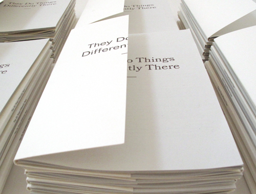
Do Graphic Designers just pick typefaces? Sometimes ‘rationale’ can become a cumbersome and overwrought part of the design process (whatever that might be) and other times it provides the perfect funnel for ideas and decision making. This post outlines some of the thinking behind the typography for ‘they do things differently there’ — an exhibition by MaCats, ECA. It originally appeared on Central Station at the same time as we were designing the print and website for this exhibition, in May 2010.
The design uses three typefaces: Folio, Bookman and Geometric Slabserif, all of which offer interesting ‘parallel’ histories, non-linear maleable history being a distinguishing feature of this exhibition. Any aesthetes or gridniks out there may wish to look away at this point.
Folio: Designed in 1957 by Bauer and Baum, Folio was one of the first popular swiss sans serifs in the late or international modernist style, but has since become overshadowed by the ubiquitous Helvetica, (also developed in 1957).
Geometric Slabserif 703: a precursor to the more popular Memphis typeface by the same designer: Rudolph Wolf… so like an early draft of a more popular later version. Memphis too has been overshadowed by more popular slabserifs: lubalin and rockwell, and to an extent serifa…
Bookman BT Headline: The original version of Bookman was designed by Alexander Phemister, born Edinburgh 1829 – “Bookman … has become a lastingly popular ‘workhorse’ design for plain, easy-to-read text, and to some extent for display as well. It is derived from an oldstyle antique face designed by A. C. Phemister around 1860 for the Scottish foundry of Miller & Richard, by thickening the strokes of an oldstyle series. From there on, his design was copied and refined over and over again, starting with the Bruce Type Foundry (Antique No. 310), MacKellar (Oldstyle Antique), Keystone (Oldstyle Antique), Hansen (Stratford Old Style). His design of Bookman was refined at Kinsley/ATF in 1934-1936 by Chauncey H. Griffith. … Numerous implementations of Bookman exist, such as the free URW Bookman L family, and the free extension of the latter family in the TeX-Gyre project, called Bonum (2007).”
The reason for using this typeface is slightly different to the others — it hasn’t been forgotten, overshadowed or overlooked, but it does have an interesting ‘parallel’ history with many different versions and iterations of the same face continually being cut (going viral, to make a web 2.0 parallel)… and an Edinburgh connection.


