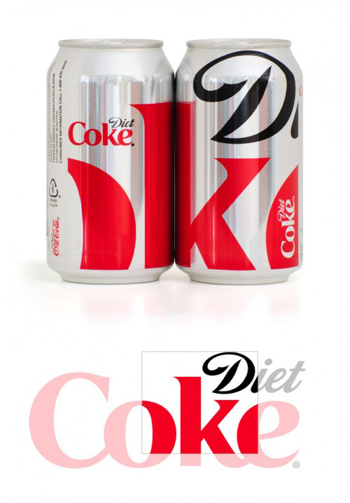
A refresh for one of the worlds biggest ‘brands’, where ‘make the logo bigger’ is taken to it’s logical conclusion, and both less and more are more. But what do the customers think? Here speaks one, from the erudite comments section on the Creative Review blog;
“Okay, I have to say this. I dont mean this in a derogatory manner, this is just how I read the can. I didnt even see the swirl from the o in coke. Therefore, I read the can as saying “dike” instead of di and oke from the way that it is cropped. In some angles, you cant even see the o. In most of the angles, at first glance, this looks like it reads “dik” or “dike”. What an abomination.”
And to provide the editorial balance for which this blog is renound, if indeed the maxim is correct, this is (part of) what google says the coke brand is.
via Creative Review – Turner Duckworth gives Diet Coke new look.