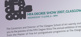
We’ve already flagged this up as a typographic phenomena reaching extreme saturation levels, but the extra bold outline block of text has really reached it’s overdue date when it appears in conjunction with the GSA Hothouse font of our own dear institution, (which is pretty terrible anyway, so is perhaps enhanced by this in-vogue rendering…).