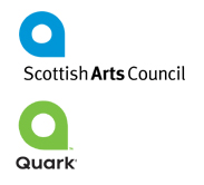
Always about 5 months off the pace, I just came across the new Quark logo, which looks not dissimilar, (in fact, lets cut to the chase), identical, to the current Scottish Arts Council logo. Design â??bloggersâ?? are up in arms about who did what and who copied who, but the inescapeable fact is that these are both just terrible logos. Banal, pedestrian and cold, if I had anything to do with the production of either I would rather have it put down as unashamed design theft than claim responsibility for having come up with them under my own steam.
As luck would have it, the Scottish Arts Council is due to be dispanded and replaced with â??Creative Scotlandâ?? in 2007, so the two organisations won’t have to suffer this identity crisis for too long.